I’ve come up with a unique way to measure how well California cities are doing. It shows those with well-run finances grow in population, while those badly run shrink. It’s a generality. There are exceptions.
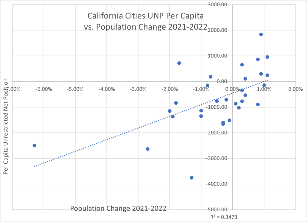
But look at the trend line on this chart.

Notice the trend line, the dotted blue line, is running steadily upward to the right. That shows a relationship.
The Y axis (vertical) shows the percentage change in the city’s population from 2021-2022. The X axis (horizontal) shows the city’s per capita Unrestricted Net Position. A positive number means a surplus, which is good. A negative number means a deficit, which is bad.
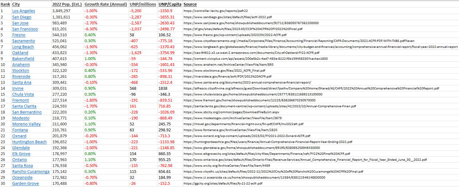
The UNP is derived from each city’s Annual Comprehensive Financial Report for the fiscal year ending June 30, 3022; except for Bakersfield, where it’s June 30, 2021. The ACFR is an audit of the city’s finances for a specific fiscal year. It’s much better than a budget, which can include a lot of wishful thinking. All the UNP data used are included below, along with the links to the ACFRs.
Divide the UNP by the city’s population and you get the per-capita UNP. Well-run cities enjoy a positive number, or at least a small negative number. Badly run cities have a high negative number.
Read Pacific Research Institute economist Wayne Winegarden’s “Free Cities Index.”
I am limiting the data to the 30 most populous cities in the state. That way we can eliminate outliers, such as a small city that just developed a lot of new housing with a sharp population increase. The 30 included all are old, steady cities.
Some Easy Math
Please excuse a little statistical math. Don’t worry, you don’t have to be Oppenheimer. (Great movie. Just saw it.)
Then the key calculation is the R2 Coefficient of Determination, or “R squared.” It shows how well the regression analysis fits the data. Nowadays it’s easy to calculate on an Excel spreadsheet: Just push the “Scatterplot” image.
An R2 of 1.0 means total correspondence. For example, for NBA players, the taller the better. So the R2 for height compared to points scored would be at or close to 1.0.
By contrast, an R2 of 0.0 means no correspondence at all. For example, if we put together NBA points scored and the temperature outside the arenas in which the games were played, the R2 would be close to or at 0.0. Irrelevant. Values between 0.3 and 0.7 show some relationship.
Back to my chart.
Notice the R2 is 0.3473. It’s displayed on the bottom right of the chart. That shows cities with high per-capita negative UNPs are losing population faster than those with positive UNPs. It is also possible that the population flows cause the sound budgets. That is, whatever attracts people to a city ends up also boosting its revenues, helping balance its budget. Advocates for bigger government might make that argument – but it only reinforces the idea that cities that attract residents for whatever reason end up doing better fiscally.
The worst city-dot on the far left of the chart, losing more than 6% of its population, is San Francisco, with a per-capita UNP of -$2,499. Next over is San Jose, the heart of Silicon Valley, losing 2.7% of its population. It has a per-capita UNP of -$2,587.
Both San Francisco and San Jose form what remains the world’s high-tech and internet centers. Their billionaires and millionaires pour out a wealth of tax revenue beyond the dreams of the most avaricious public-employee union member. Yet they are abysmally run.
The worst per-capita UNP among the Top 30 was Los Angeles, at -$5,200; and a population loss of 1%. And let’s not forget Oakland, with a per-capita UNP of -$1,629 and a 1.3% population drop.
When I was former state Sen. John Moorlach’s press secretary from 2017-20, he put out reports on the UNPs of every California city, county, school district and university system, as well as all 50 U.S. states. Of my new data, he pointed out to me the worst cities also are those with crime problems. And part of the problem is their budget struggles don’t let them hire enough police. He also wondered how long the lenders supporting the deficits will keep the money flowing.
Lower tax base
A declining population also means a lower tax base to maintain infrastructure. A dramatic example is what happened to my native city of Detroit. Its population dropped from 1.8 million in 1950 to 621,193 today – a two-thirds crash. It declared bankruptcy in 2013.

The city controlled the metro area’s sewer system and let it deteriorate badly. As part of the settlement arranged by U.S. Bankruptcy Judge Steven Rhodes, Reuters reported in 2014, “The deal with Oakland, Wayne and Macomb counties creates a regional water and sewer authority, but allows Detroit to maintain control of its local system.”
Is there a bankruptcy threat for the worst California cities? Moorlach pointed to Richmond, whose population is too low to be in my Top 30 list, as most at risk. Richmond’s 2022 ACFR showed a UNP of -$454 million. For a population of 115,639, that works out to a per-capita UNP of -$3,926. Worse than Oakland’s -$3,755.
For now, even the worst cities, including Richmond and Oakland, still are not in bankruptcy territory. But a recession could push them there, as happened a decade ago to San Bernardino and Stockton. Notice on the data below both those cities, after a federal judge rearranged their finances, are doing relatively well. Stockton’s per-capita UNP was -$534 and its population went up 0.4%.
San Bernardino was worse, with a per capita UNP of -$1,026, but it enjoyed a 0.2% population rise. Of course, San Bernardino also is an inland city where many coastal exiles have fled for cheaper housing, if they haven’t gone to Texas.
In conclusion, city budgets have a direct effect on the delivery of city services. There’s no reason why any city should be running a negative UNP. As with a personal or business budget, irresponsible borrowing eventually leads to bad outcomes.
John Seiler is on the editorial board of the Southern California News Group. Write to him at [email protected]
